Working with 70 product variations
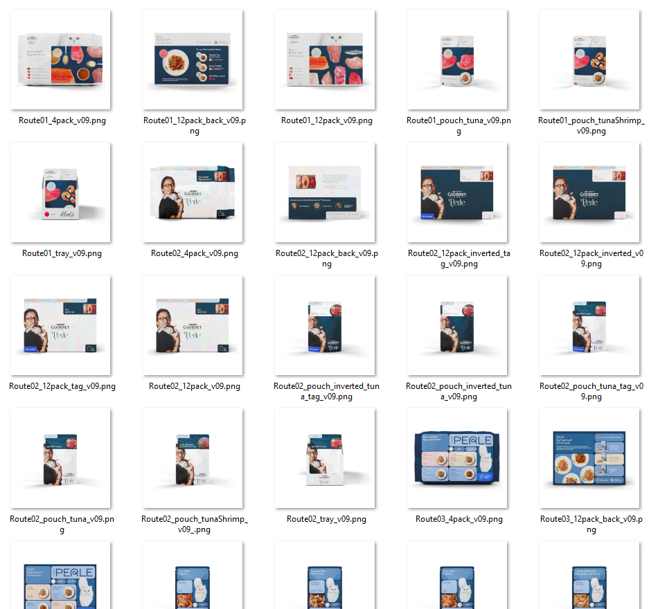
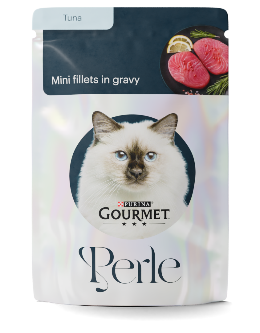
At TBWA Norway, graphic designers were working on a rebranding for the cat food Perle. Three designers were designing a direction each, and they wanted me to illustrate the designs in 3D. Both to see their designs in situ, and to show the client.
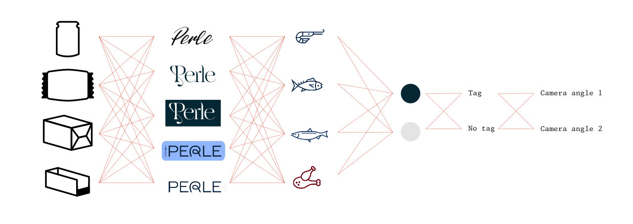
This project quickly had me out of my depth. Four pack types, five visual directions, four flavors, two color schemes, and little variations for each. Seventy images in total, updated with new designs every day. I fluffed it up for the first round.
Why does it look different on my screen?
When a designer designs designs meant for print, she faces a color conundrum. Her color palette consists of cyan, magenta, yellow, and black, but her monitor shows only red, green, and blue. She must accept that it will be a little different when she sends it to the press.
The press itself is not like others, with small ink idiosyncracies. The pack is printed, treated, folded, filled, and sent to the photographer. The photographer (who wants to snap a selling shot) sets up lights, and skews the colors ever further.
The light that hits the pack goes to the lens and hits the sensor, where the photocells react and make an image. The image saves, tagging every pixel with a color from a catalog of sixty-five thousand, five hundred and thirty-six.
The designer sees the photo. She furrows her brows. Someone must’ve made a mistake!
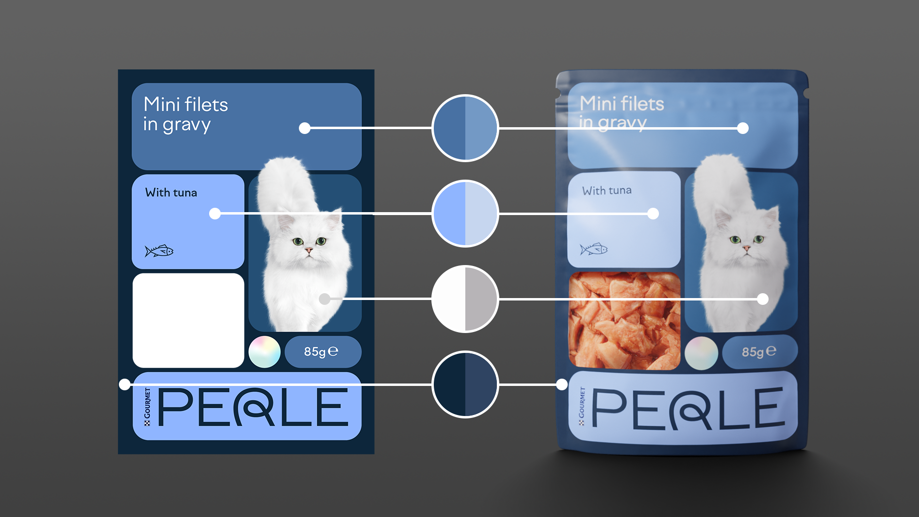
Looks like it’s just brighter and less saturated, but there are changes in hue, saturation, and value—in all different directions.
Photography in my 3D world is no different from the real world. I get told off for the colors I deliver. I pedantically lecture back on the nuances of color science for ten seconds before they stop me with a “fine, fine, let it be.”
This time I heard “Make it work.”
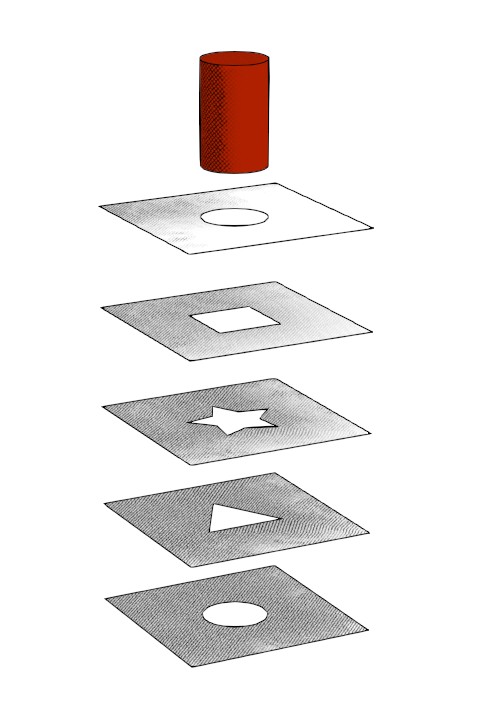
"Make it work."
For most projects, I can adjust the colors in Photoshop. That is not workable with seventy images daily; this task needed automation.
Along with the image I render a diffuse color pass. That is a version of the image with no lighting or shading; just the pure RGB values. (It’s important to save it with straight, linear, no-bullshit color mapping.) The built-in compositor automatically blends the images with blend modes color and saturation. That brings the intended colors back to the image. (In my experience, the very light and very dark areas should be spared this treatment.)
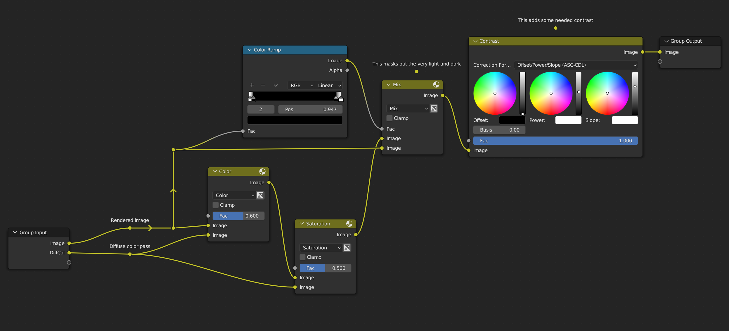
Every image went through this pipe before saving itself.
Particularly in branding is it important to retain the right brand colors in all imagery. And though I prefer the natural look of untampered images, I can now offer what brand designers love: the RGB values they meticulously crafted.
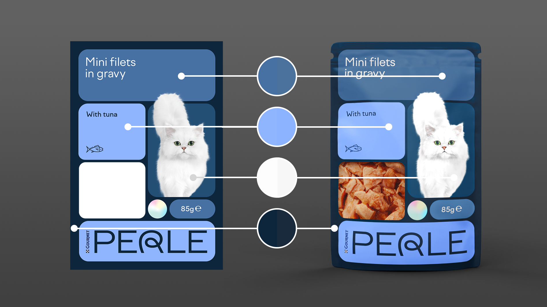
The right colors come at a cost. It breaks the realism in many ways.
How do pearls work?
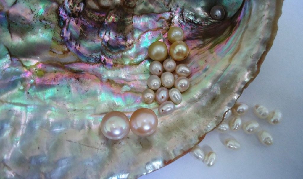
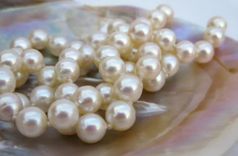
The brand is named Perle. Of course we had to incorporate a pearl-like effect in the packaging. We can do that by layering a thin iridescent film over the packaging.
I knew I needed reference images. Every time I make something from memory, it looks off. No matter how well I think I know the concept, I miss details. This is well-established in psychology. Look at how people draw bikes from memory.
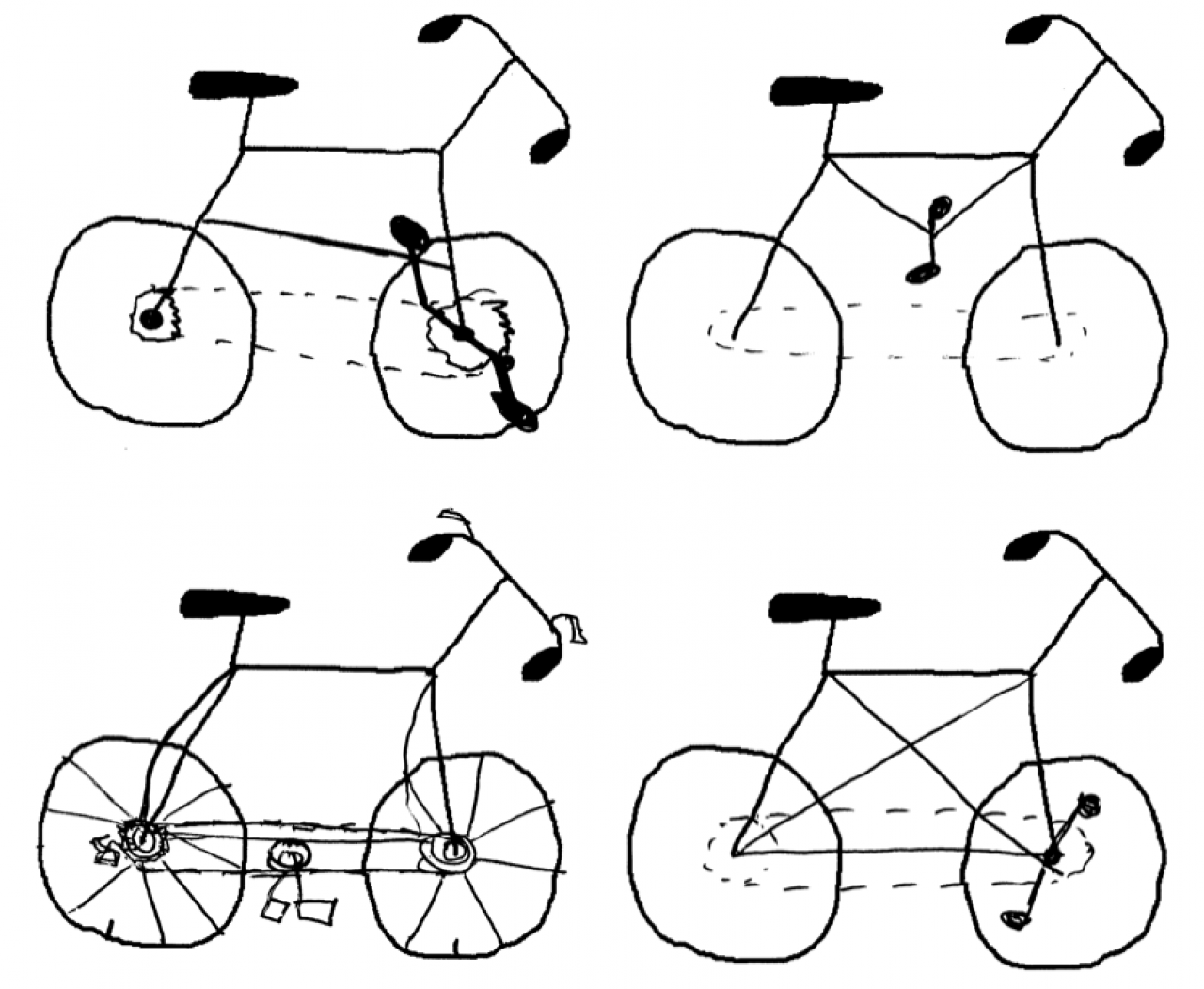
Established cycology.
I gathered images of iridescent packaging. They would often look more metallic than pearl-like. This did not exhibit the elegance I wanted.
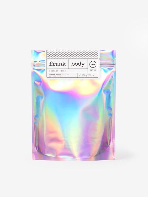
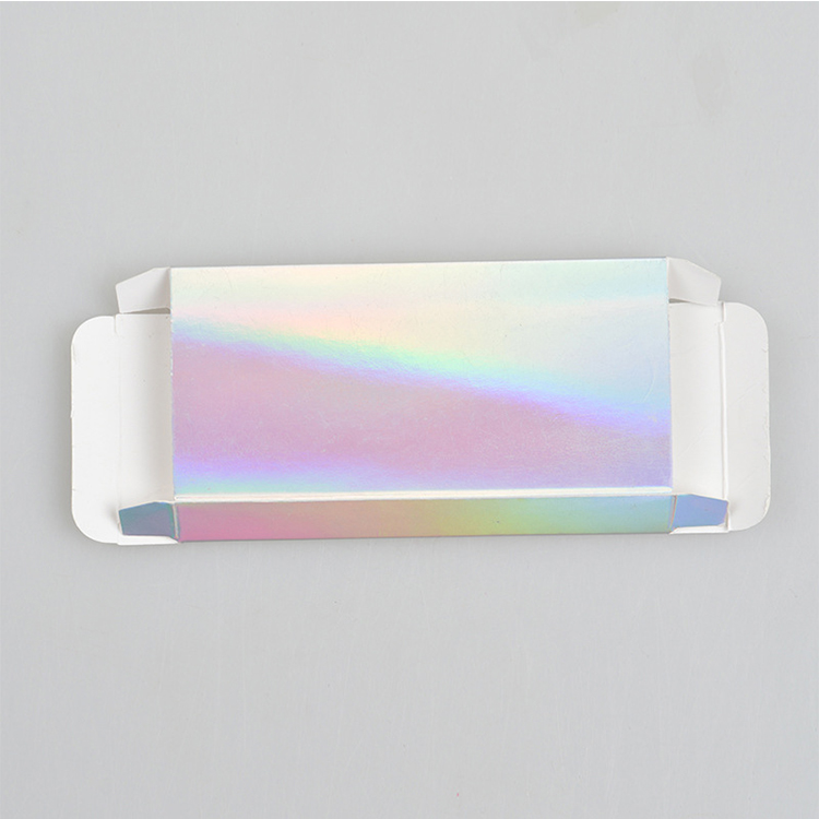
I recalled a lamp I had once seen. It looked like porcelain, but with a hint of that soap bubble sheen. I looked up pearl porcelain.
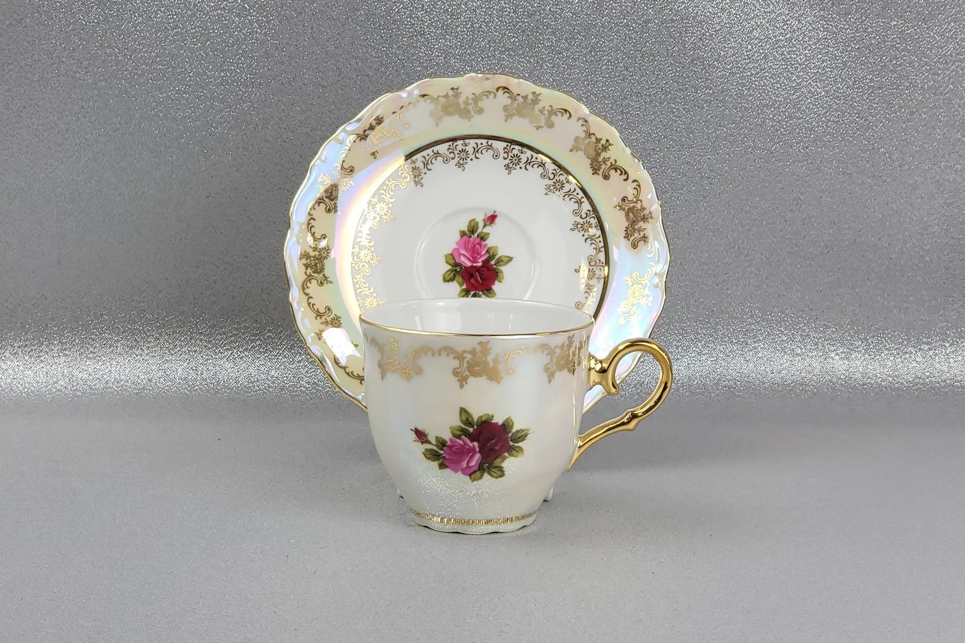
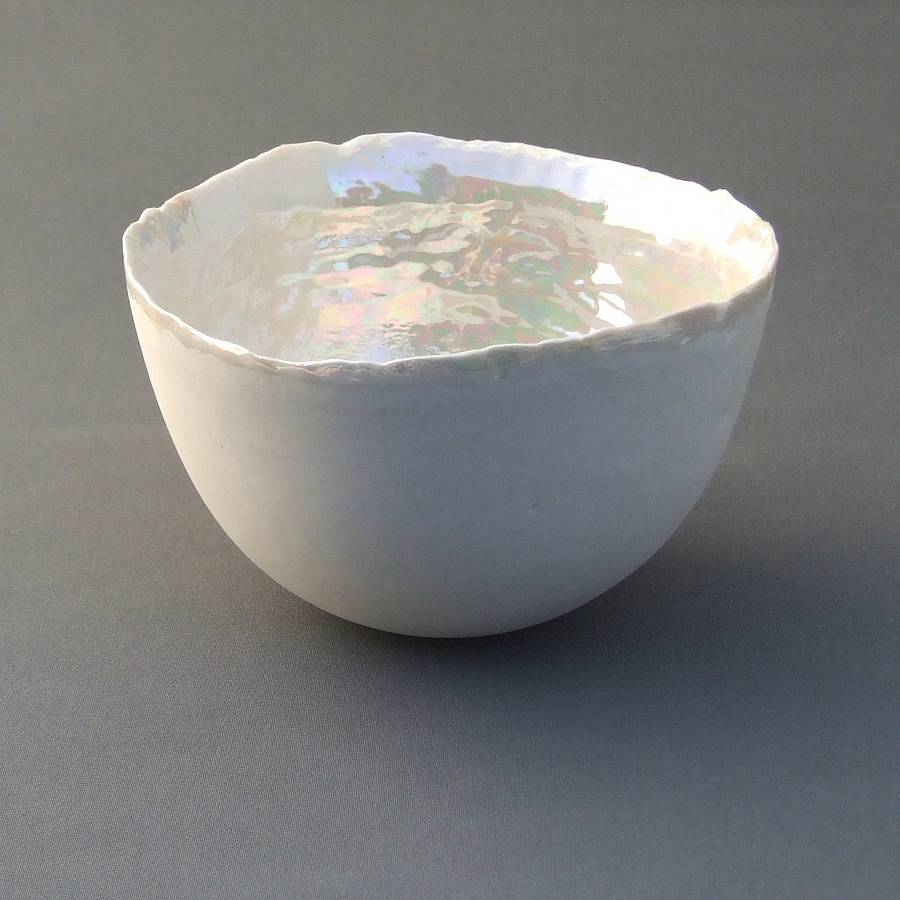
Bingo. The pure white with a subtle shimmer and a clear coat on top. Wikipedia explained that the colors come from how the light hits it and how thick the material is. That’s how I recreated the material we showed to the client.
You want how many?
More pictures isn’t just more pictures. At a point, (about when a group becomes a horde,) the the number causes problems. I hadn’t dealt with these problems before.

I had to render seventy images. And when a design changed, I had to render each of the seventy variations affected by the change. The structure I was used to just wouldn’t cut it. I tried, for a bit, but realized that this needed a pipeline built form the ground up. So I drew one.

- Color palette propagates the same colors to everything down the line. Great if the colors change.
- Material components are surfaces. Pearl film, wax paper, matte plastic, transparent plastic, cardboard. If I finesse any of them in this file, they update in every other file.
- Model files contain a pack. Pouch, 4-pack, 12-pack, or tray. On the pack, I combine material components to make up the finished pack.
- Studio scenes contain cameras and lighting. This needed some clever light linking because a box needs different lighting than a pouch, and the pearl surface different lighting than a matte plastic.
- Photoshop would batch process the images with a color adjustment and some filters.
Would I do it again?
I admit it. Systems do excite me. It was fun to solve this logistical challenge, and I learned a lot. Next time, let's make it even bigger.
